Project Overview
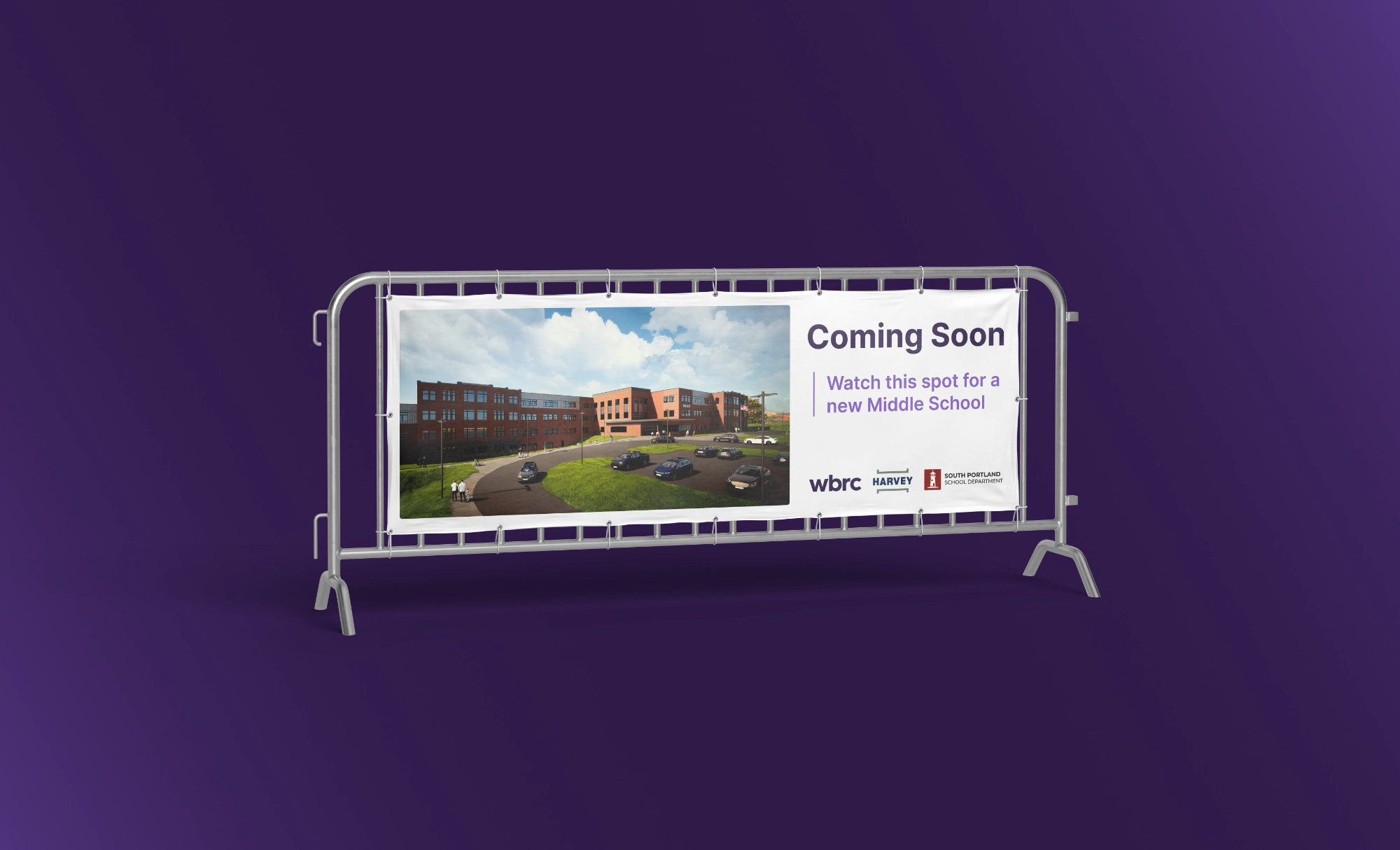
WBRC is a multi-disciplinary architectural and engineering firm serving clients across the country. On its 120th anniversary, WBRC sought to update the firm’s name and look. The firm decided to accomplish this project in-house with the help of Marketing Specialist Landon Cornelius who moonlights as a Brand Designer.
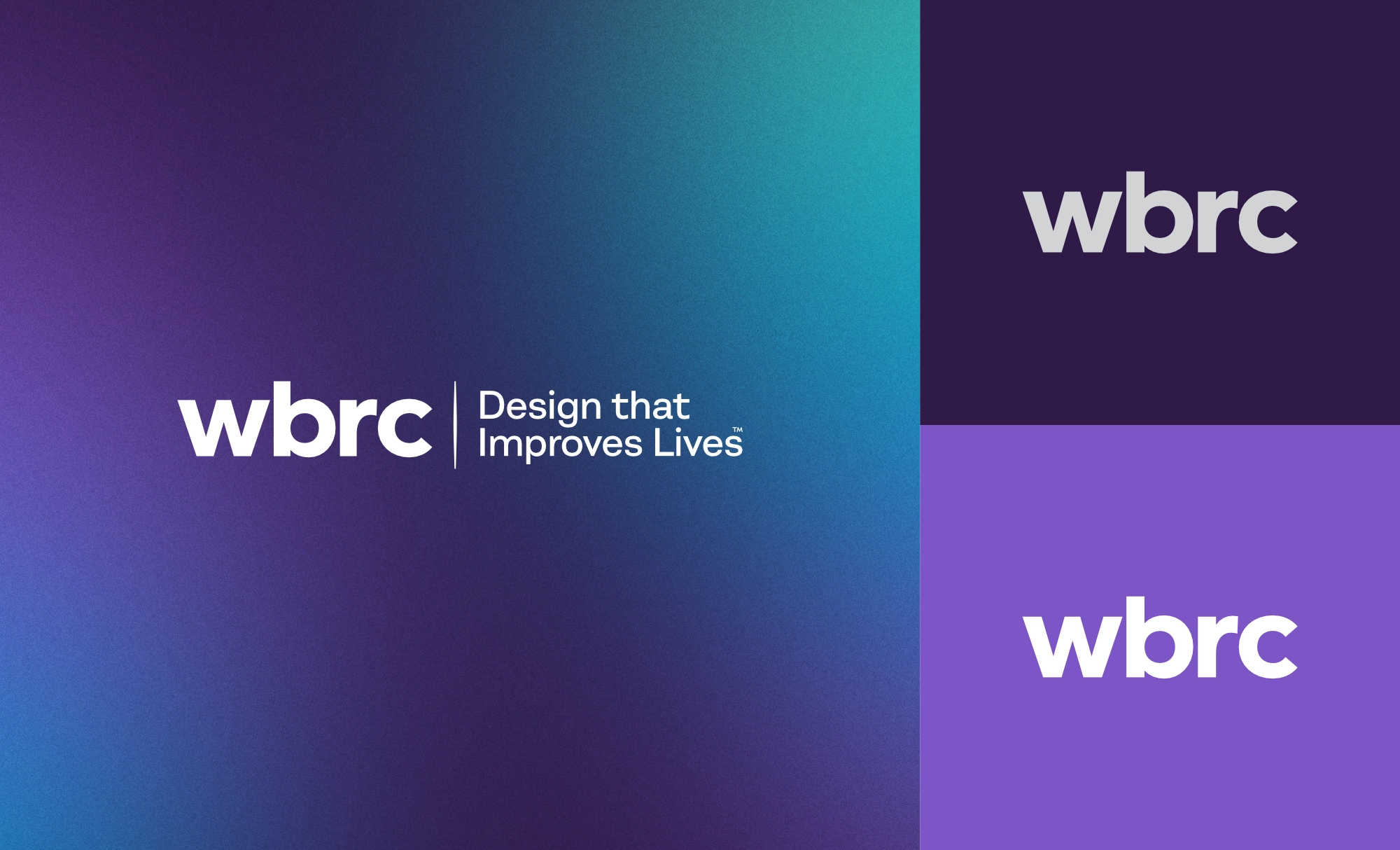
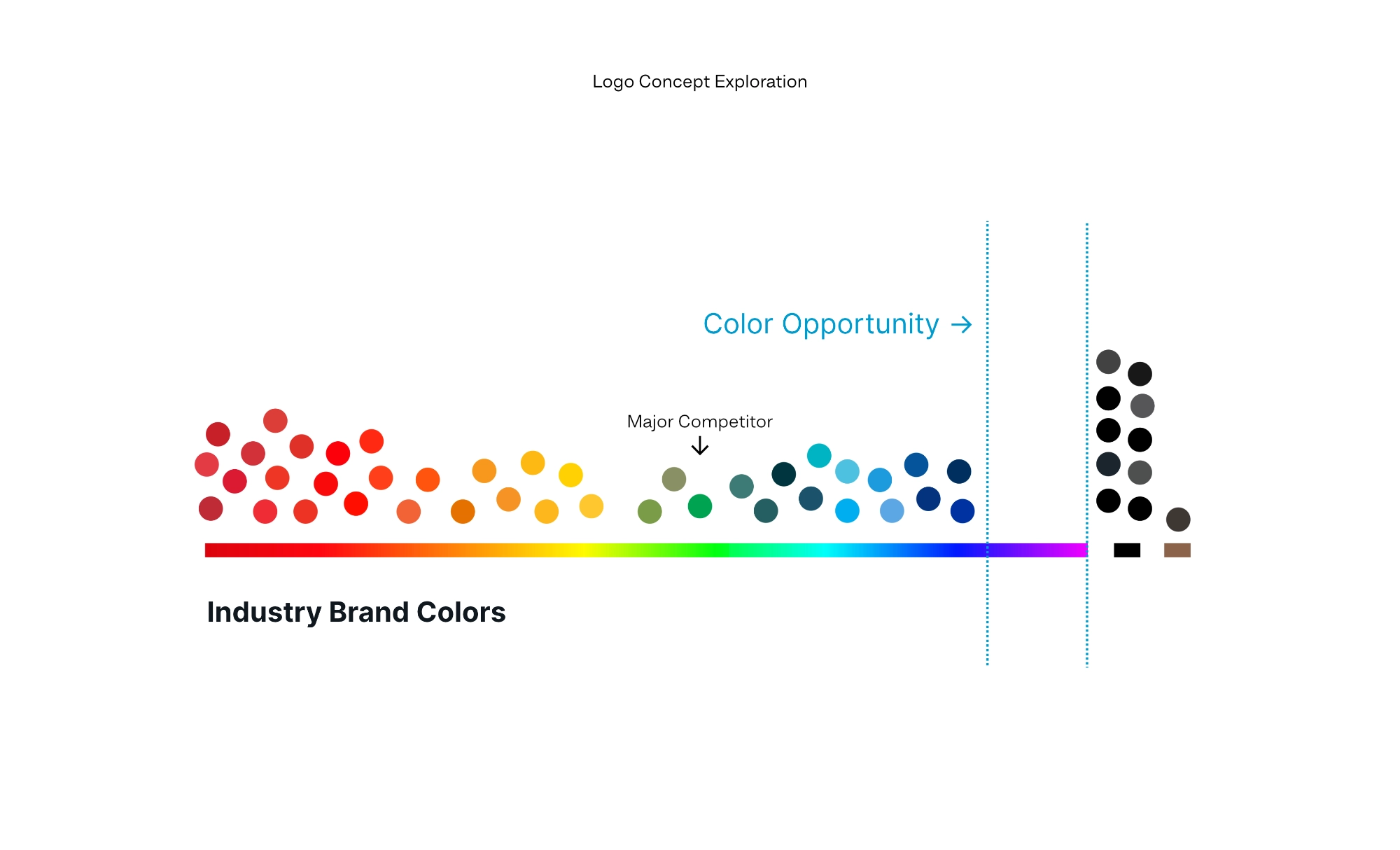
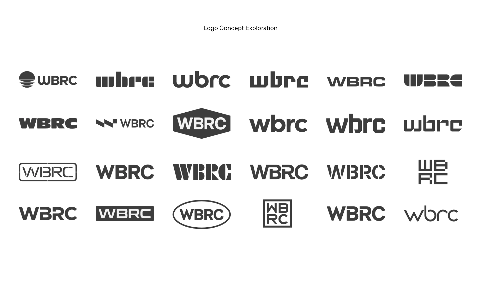
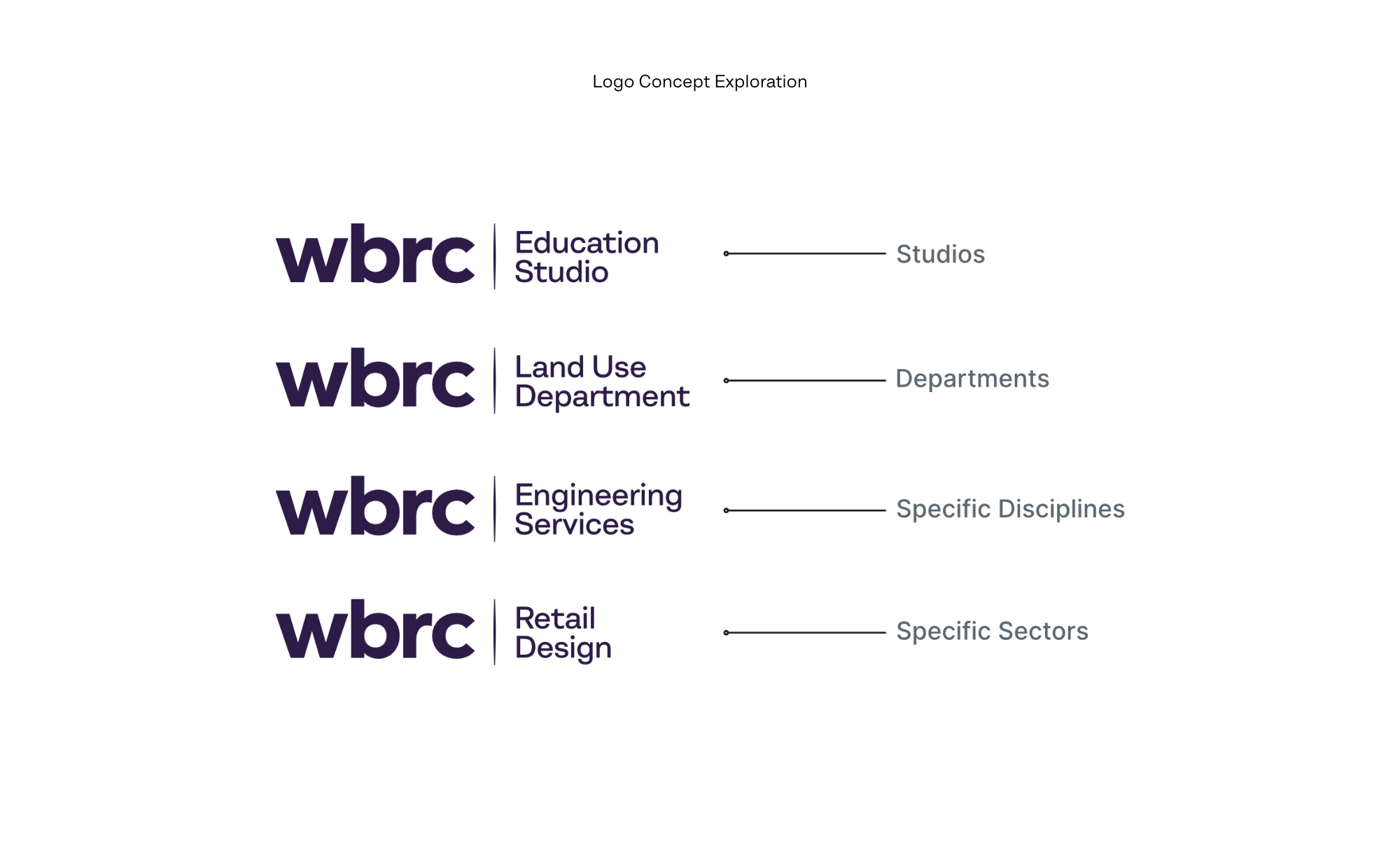
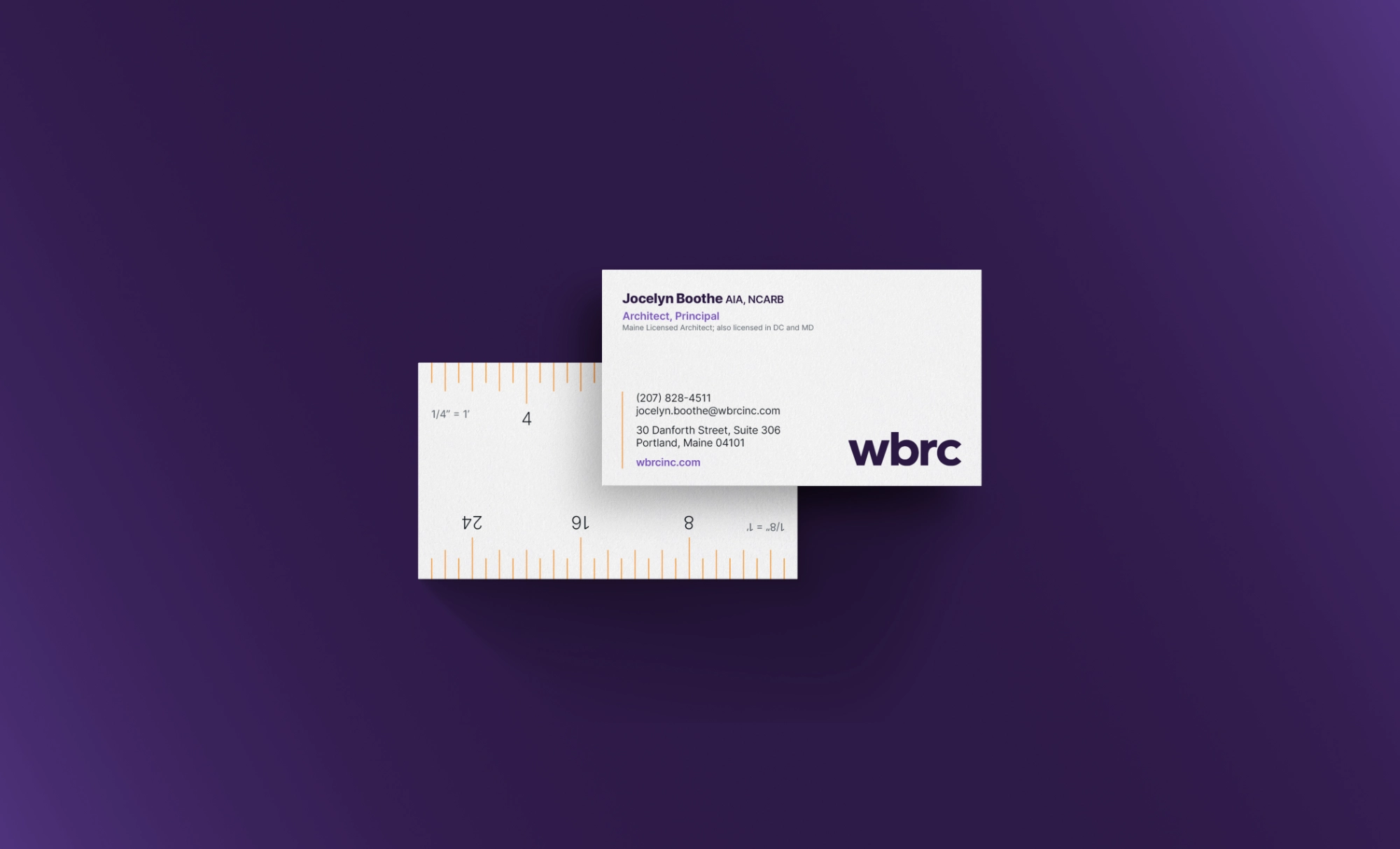
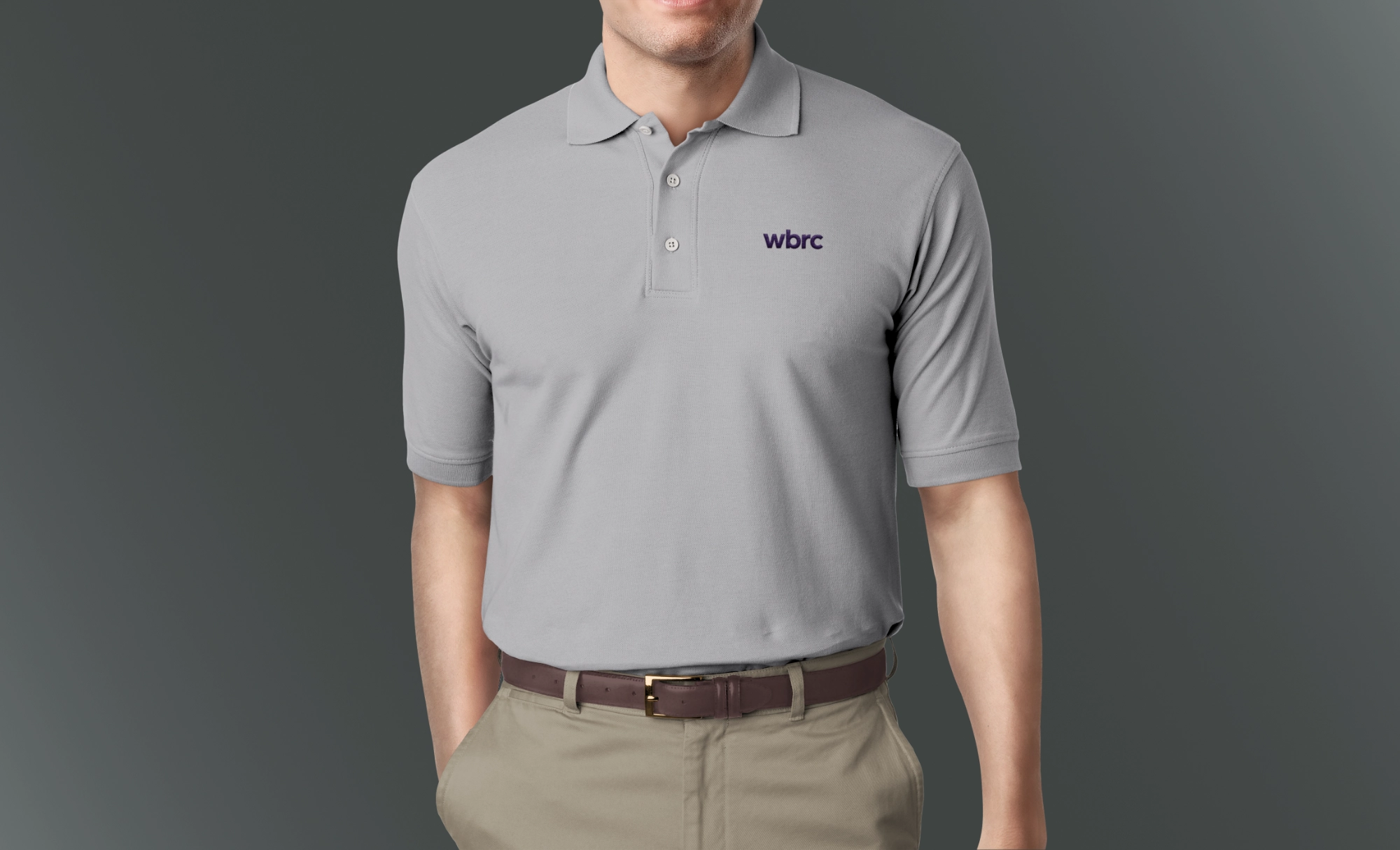
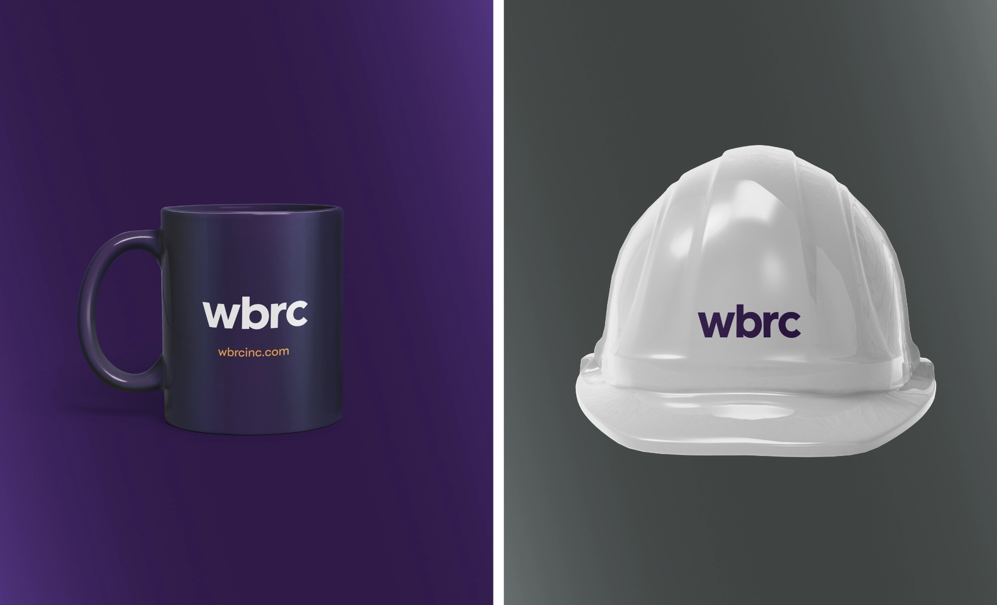
In an effort to be as pragmatic and approachable as possible, the new look was meant to clarify and simplify. This project was backed by the mission to demystify the architecture industry and encourage ethical practices among firms and clients. The big change for the brand was the use of the purple color spectrum. This was an unusual move for the industry, but it was well-received. The new logo is set in lower-case to be more legible so that the “B” and “R” letters are differentiated from each other.