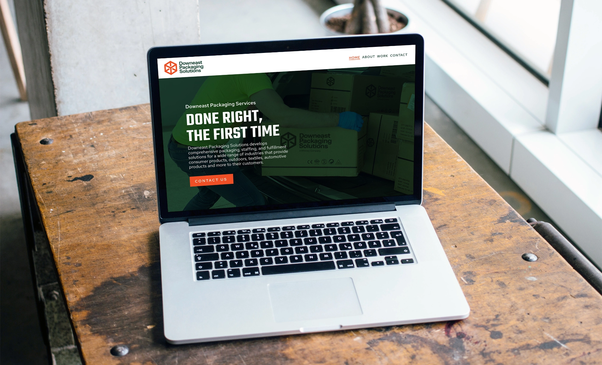
Project Overview
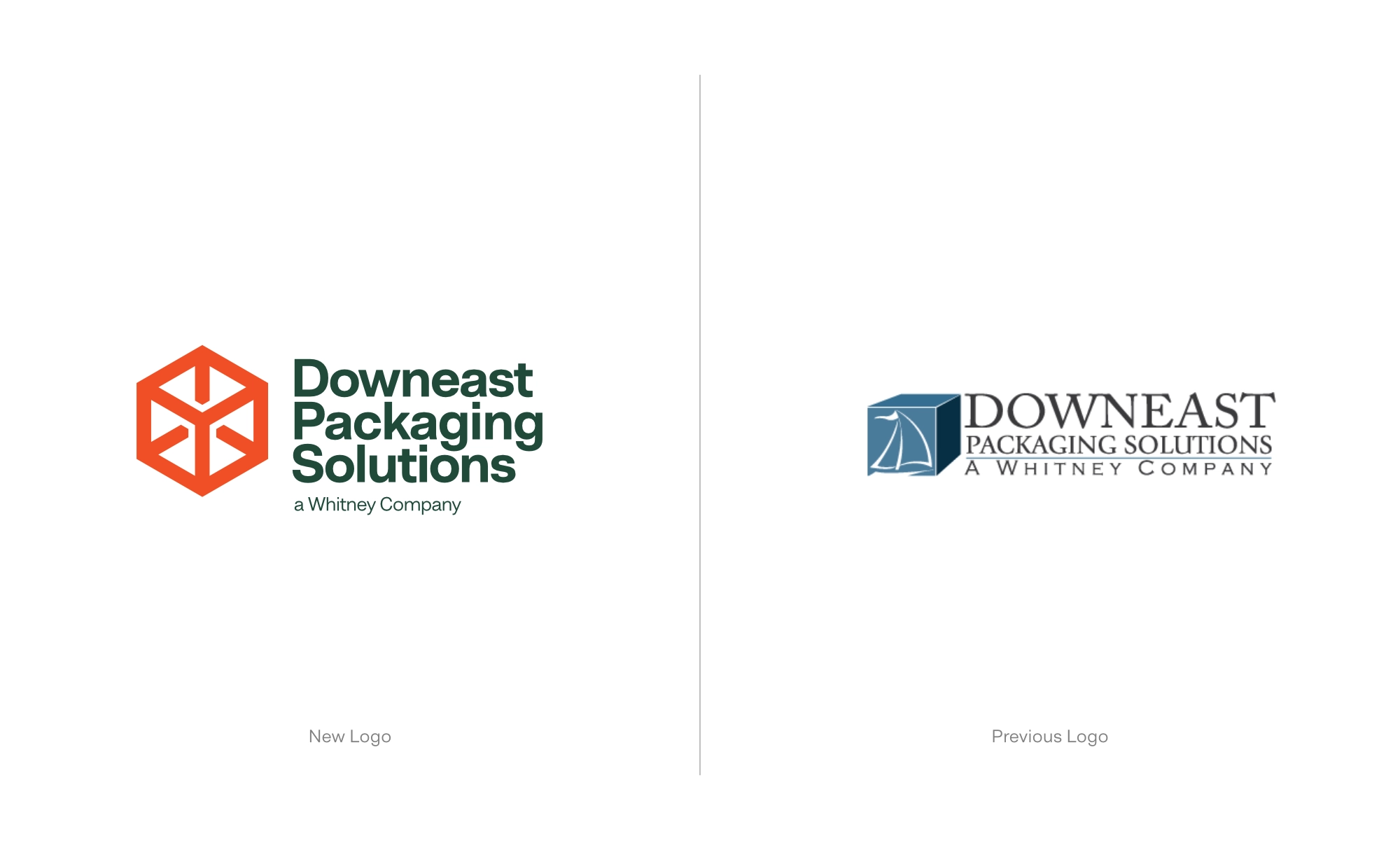
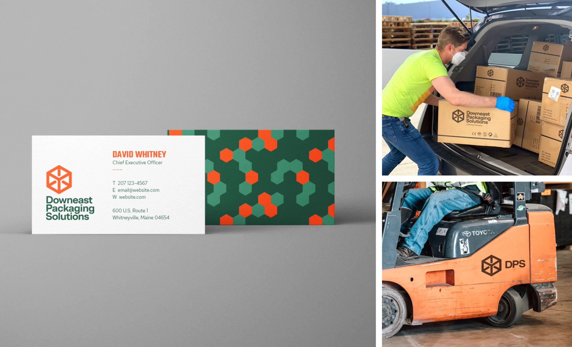
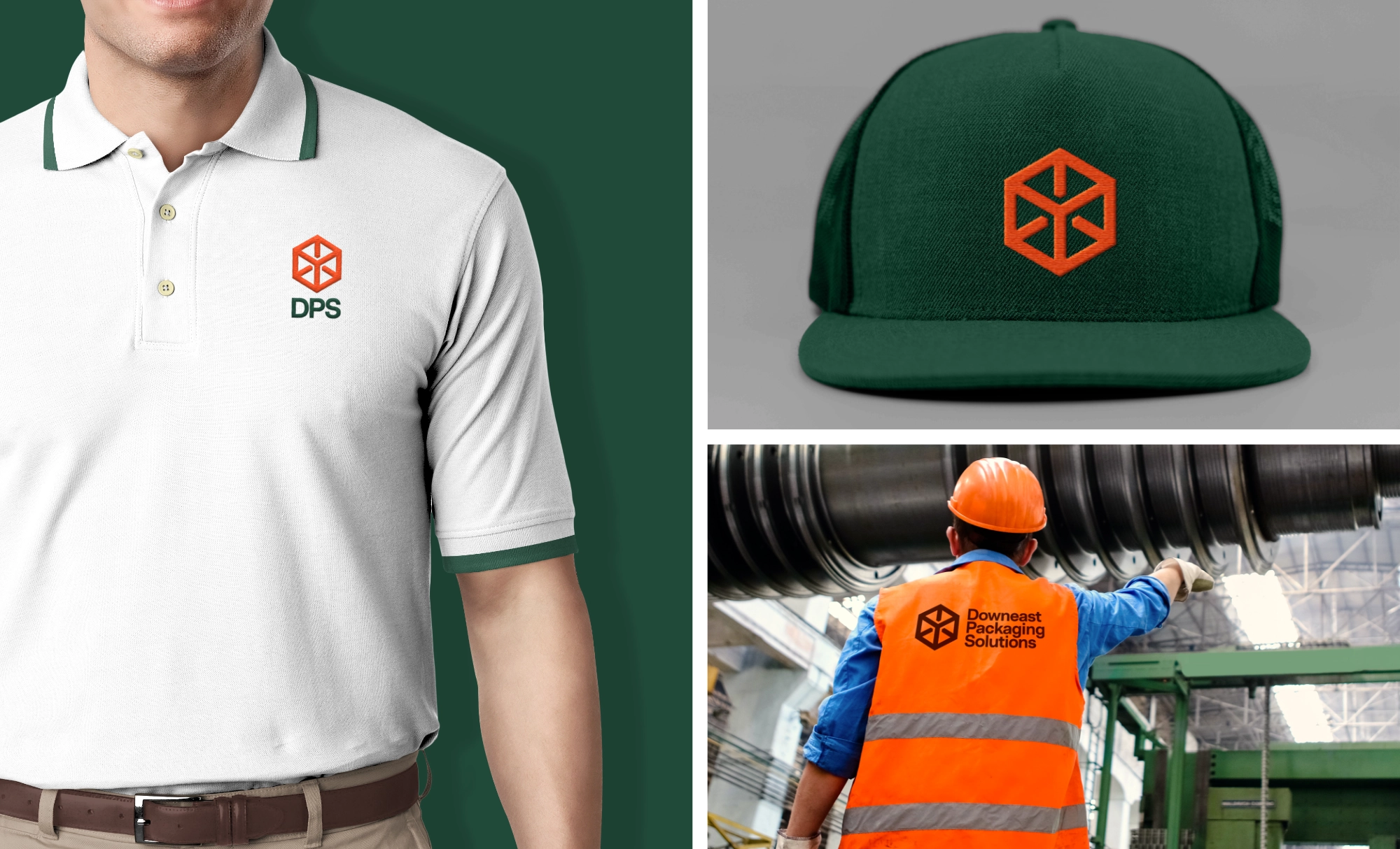
Downeast Packaging Solutions (DPS) offers facilities and labor for businesses needing to outsource the packing and shipping of goods. The company was seeking to grow business while pivoting to a slightly new customer base. They teamed up with Landon Cornelius to create a new logo, brand colors, and typography.
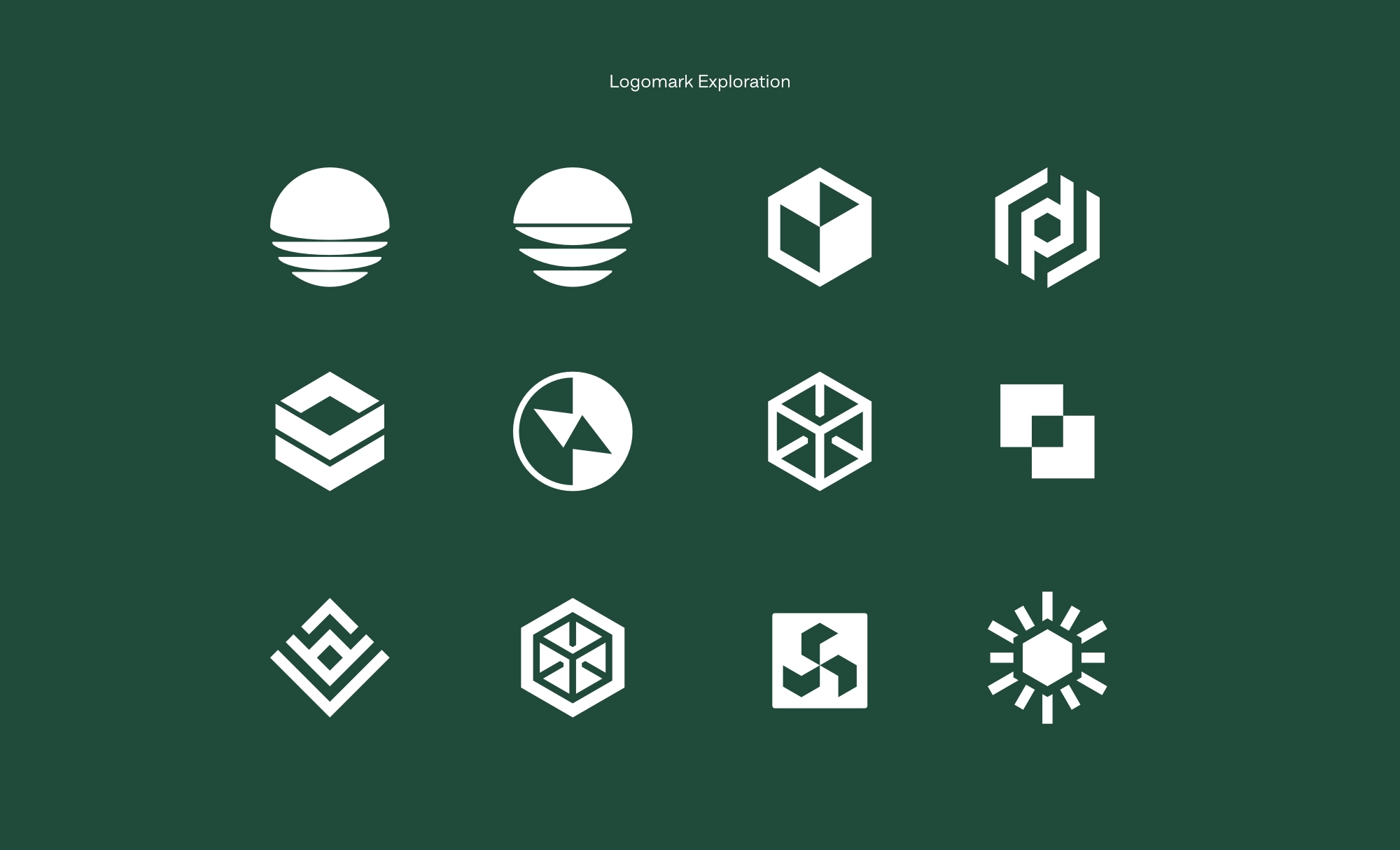
The goal of the project was to develop unique branding that referenced Downeast Maine but still appealed to out-of-state markets. When asked if he had a single idea he wanted explored during the design process, the CEO mentioned “truth”. To him, the sunrise and the ocean tides were great symbols of truth. The result of that exploration was a conceptual sunrise logo and a more literal box logo. After extensive testing between the conceptual approach and the literal approach, we opted to embrace the box mark. The box mark, while abstract, represented DPS better to current and potential customers.